Logo Design: Sacred Rose Medicinals

Objective
Design a logo and brand identity for Sacred Rose Medicinals, a local acupuncture and spiritual wellness clinic located in New Albany, Indiana.


Sarah Beth is the founder of Sacred Rose Medicinals, offering a variety of services such as acupuncture, reiki, craniosacral therapy, and more. Her priority is creating a safe, authentic space where both community and individual wellness are nurtured.
Existing Business Logo
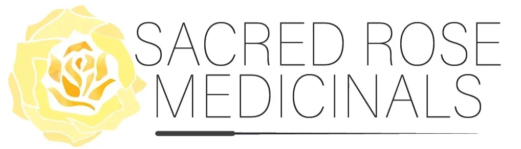
The pre-existing logo for Sacred Rose Medicinals featured a yellow rose with the title of the business. Before beginning with new ideas, it was important to understand where the existing logo needed changes in both graphics and typography.
Sketches & Digital Ideation


Graphics: remove acupuncture needle, softer rose design, less white space, organic shapes
Typography: script font, handwritten style, inclusion of Sans-Serif subheading text, capitalized words
Color Palette: soft yellows, outlined rose
Tone: airy, soft, open, comforting


Final
The final logo with text follows the airy, light aesthetic that defines the business’s work. Thin organic outlines on the yellow rose paired with a handwritten script font communicate comfort and softness while still maintaining a brand identity.
